A portfolio of my data visualisations curated for my Data Visualisation module, my participation in Journocoders, and my ambition as a Motorsport Journalist.
Formula One’s Global Expansion: Embracing New Markets and Audiences
This is a feature article about the expanding market for Formula One in the US through DTS and an analysis of historical tracks and Liberty Media’s financial records.
From Silver Arrows to Prancing Horses: Twitter Gallops Ahead on Hamilton’s Big Move

A report based on scraping Twitter on the 2nd of February 2024, when Hamilton announced his move to Ferrari.
Aero or Team Dynamics: An Analysis of Aerodynamics and Aeroelasticity in the RB20 and MCL38.
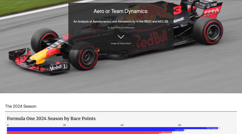
A report on the 2024 season team dynamics in the constructors’ championship and a breakdown of the aerodynamics in both cars.
An Interactive Campus Tour: Gold Award Reflection

A concept idea of the fear of public speaking at Campus Tours to explain my reflection through ‘Scrollama’.
European Map

A European map to understand the historical landmarks of Formula One circuits.
Stacked Bar Charts
A stacked bar chart deciphering the gross revenue intake per quarter since the Liberty Media Acquisition.
Pie Charts
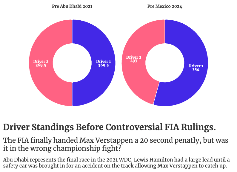
A pie chart comparing the points between Verstappen and Hamilton prior to Abu Dhabi 2021 to Verstappen and Norris in Mexico 2024.
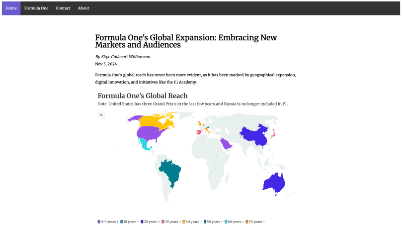
World Map
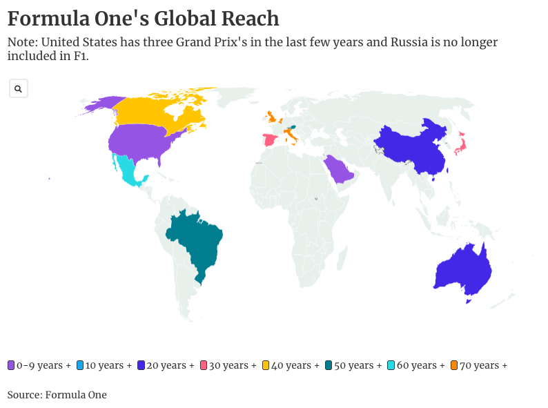
A world map showcasing Formula One’s reach as well as the the formation of circuits throughout the years.
